
The Nancy Meyers' Movement
Safe to say the one and only Nancy Meyers is having more than a moment. She is the moment! (for quite a few years) The beautifully designed sets on Something's Gotta Give, Father of the Bride, and The Parent Trap! Yes, THE Parent Trap. We Millennials have been primed to adore her style since we were rocking jelly sandals and listening to hit clips. Let's talk about the brilliance of her design and how to get it!
Hilary Wingate
8/6/20255 min read
If you're here, like me, you're taken with the grand millennial/coastal grandma style and are slowly incorporating one too many pin stripes into your home. Safe to say, the one and only Nancy Meyers is not having a moment. She has been the moment for quite a few years. The beautifully designed sets on "Something's Gotta Give", "Father of the Bride", and "The Parent Trap". (Yes, girl, The Parent Trap) Have had us all in a metaphorical headlock for decades! I can confidently say it was Meyers and her team who did this to us. You saw the slipcovers, you saw the butcher blocks, you saw the French doors; and now, you see your dream home decor style.
We Millennials have been primed to adore her style since we were rocking jelly sandals and listening to hit clips.Meyers mastered telling a story through sets by designing a clean yet comfortable set that not only evoked luxury but real life. The couches, though expensive, looked like you could kick your feet up and read a magazine, without feeling guilty. The tops of surfaces had beautiful vignettes, but also some random keys thrown on top. The luxe was balanced with life. Aspirational yet achievable. They were telling us the story of the people who lived there through the decor.
Replicating the Look- key elements
You might wonder how to achieve this look without a luxurious budget, as I’m sure those sets had. Easy, it’s all about having an eye for detail. As a graphic designer, we often break down design into specifics (spec work) —what typeface is used, what colors are present, and what layout is employed. The same approach can be applied to room design.
When you look at a Nancy Meyers room, what are you seeing?
- Slipcovered sofas
- Natural linens and cottons
- Structured furniture
- Neutral color base with vibrant accents
- Print mixing
- Spaces laid out for conversation
- Antiques, family photos
- Chinoiserie
- Plenty of botanical art/hydrangeas
So let's work the set out in layers, shall we?
Background
The sets tended to have a neutral base to work with. That neutral base lends its hand nicely to playing with print mixing and bold accent color choices. It created a calm backdrop to let the other elements do some heavy lifting. So, try to keep your largest items neutral i.e, couches, chairs, tables, cabinets, bedframes, and curtains. Give yourself a clean base to play with. Wood tones and metal accents are also considered neutrals.
Both the bedroom and the office are layered in anchored neutrals. Most of the rooms are swathed in creams or tans, right? If we look closer, they are anchored by deep, mismatched wooden tables and dark lamp bases. If the rooms were too light and airy, it wouldn't carry any visual weight. Making the limited color palette fall flat.

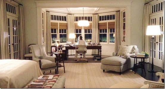
I. source: It's Complicated
II. source: Something's Gotta Give
III. source: Father of the Bride 2
I
II
III
Middle Ground
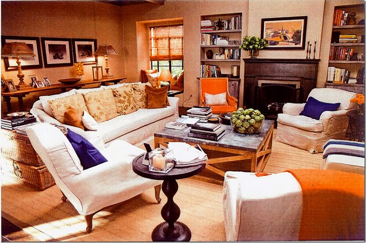
Next, let's layer on the accents. Meyers dabbled in using vibrant colors on a smaller scale. Don't be afraid to choose a color that isn't soft and delicate, like blood orange, hot pink, or lime green! As long as you use it sparsely in a blanket or a fun piece on the mantel, you won't overwhelm the room.
Accents are also the absolute perfect time to play with print mixing! It's all about balance. Think chunky nautical stripes paired with a delicate organic botanical print. Not scary! The large geometric pattern visually complements the small organic print, and the contrast helps them stand out. One tip to help make them cohesive is to keep the colors cohesive in a neutral color palette or keep them in the same color family.
II. Perfect example of having a neutral base and layering in accent colors. The orange and blue are complementary; they create vibrancy. It's not too much, though! It looks intentional because it works well.
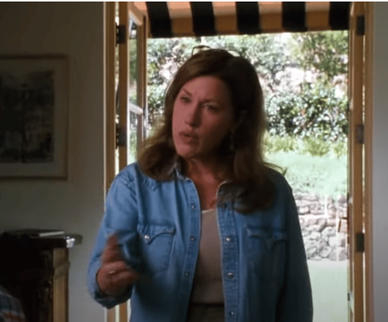
I. Behind Chassey (Lisa Ann Walter) is a classic chunky black and taupe striped awning. Though it draws the eye, it doesn't clash with the vintage black and whites next to it. I love this frame.
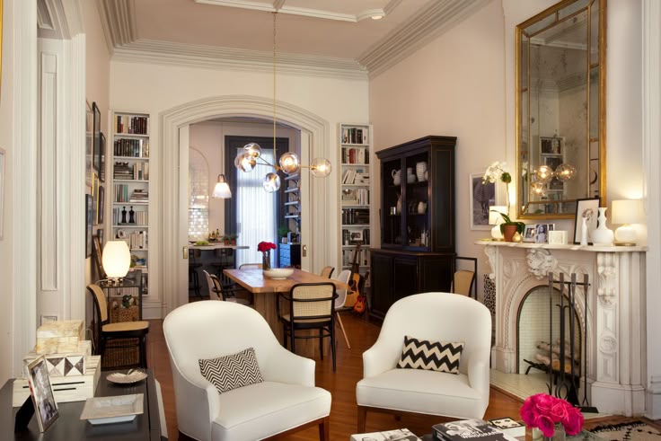
III. Are you seeing that chevron? I miss chevron. Anyway, the neutral base allows the different-sized patterns to stand out, while the same color helps them not compete with each other. You have a grounding black China cabinet, and a bright pop with the pink roses, which add more interest to the room. The room layers work together to create a snapshot of the character.
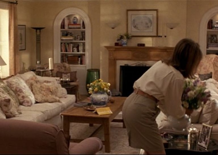
I. source: The Parent Trap
II. source: It's Complicated
III. source: The Intern
I
II
III
Foreground
The last layer is the finishing touches. Those are your knick-knacks, figurines, a stack of books, anything that adds your own story to the room. These are the elements that, once someone is cozy on the couch, help them gather what you want them to know about you. They can act as little conversation boosters for them. Give them hints at your personality/story that might invite conversation.
Zoom into the scenes on the table and the mantels, and you'll find perfectly crafted vignettes of the character's story. I can't tell you how many times I've struck up a conversation in someone's home based on wall color, pictures, or knick-knacks. Let me tell you, they all have a story about them. I have a huge custom fireplace mantel in the back of my dining nook. I get most of my comments/compliments on that. Decorate with items that make people lean in and ask What is that?
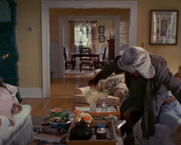
I. source:The Holiday
II. source: Father of the Bride 2
III. source: It's Complicated
I
II
III
Creating a Conversational Environment- make it easy
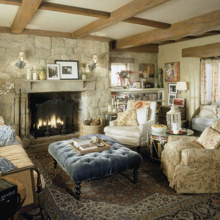
Another key element of this design style is the seating arrangement, which should foster conversation. You want to create the invitation for people to sit and converse. Think plush seating and soft lighting—task lighting to enhance the ambiance. In your own home, aim to create spaces where people feel comfortable gathering, sharing stories, and enjoying conversation.
Arrange sofas and chairs to face each other, complemented by a well-defined area rug that anchors the conversation. Have tables racked and stacked with anything your guests may need. Have a tray with coasters, napkins, or tissues. Make sure those throw pillows are extra fluffy for lounging. If you want to up the comfort, add a blanket and an ottoman! Say what you will, but if I see a well shrewn throw and plush ottoman, you're about to hear what I think of the latest gossip! You want things guests need to be within arm's reach. You invited them to talk, now make them feel good about it.
All the chairs are clustered together, creating a clear area. When people sit, they are subconsciously entering into a "conversation circle". It promotes guests to not only get cozy but also sets everyone up to engage with one another easily.
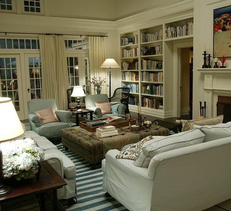
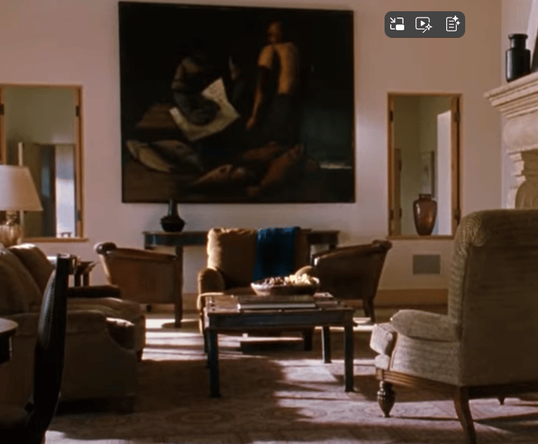
I. source: Somethings Gotta GIve
II. source: Father of the Bride 2
III. source: The Parent Trap
I
II
III
In summary, creating your own Nancy Meyers-inspired space means:
- Incorporating a neutral color palette with bold accent choices
- Working to tell your story in layers
- Inviting conversation and encouraging relaxation
- Looking at the piece's potential, not where it's from or price tag
Remember, life happens in your home. Nancy Meyers mastered telling the story of a family through the set design. Tell yours through your room. It’s not a magazine shoot; display your books, cherished knick-knacks, and personal items. Fill your coffee table with meaningful objects—a chess set from your father, a bowl of hydrangeas, or whatever resonates with you. The goal is to create a space where natural life unfolds, blending design with everyday living.
XOXO
Hilary
Inspiration
Creative content for home, lifestyle, and garden.
Explore
Connect
© 2024. All rights reserved.